Work in Progress
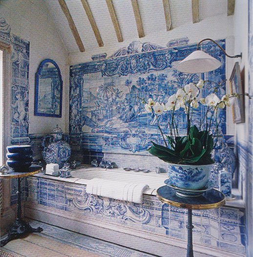
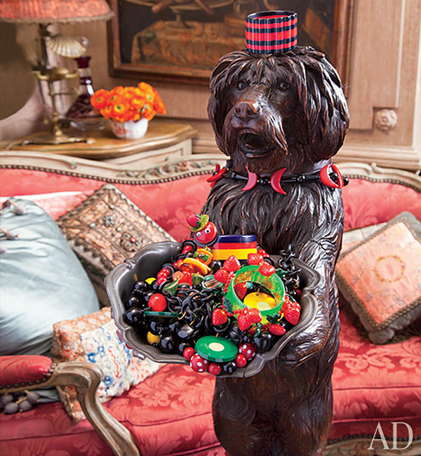
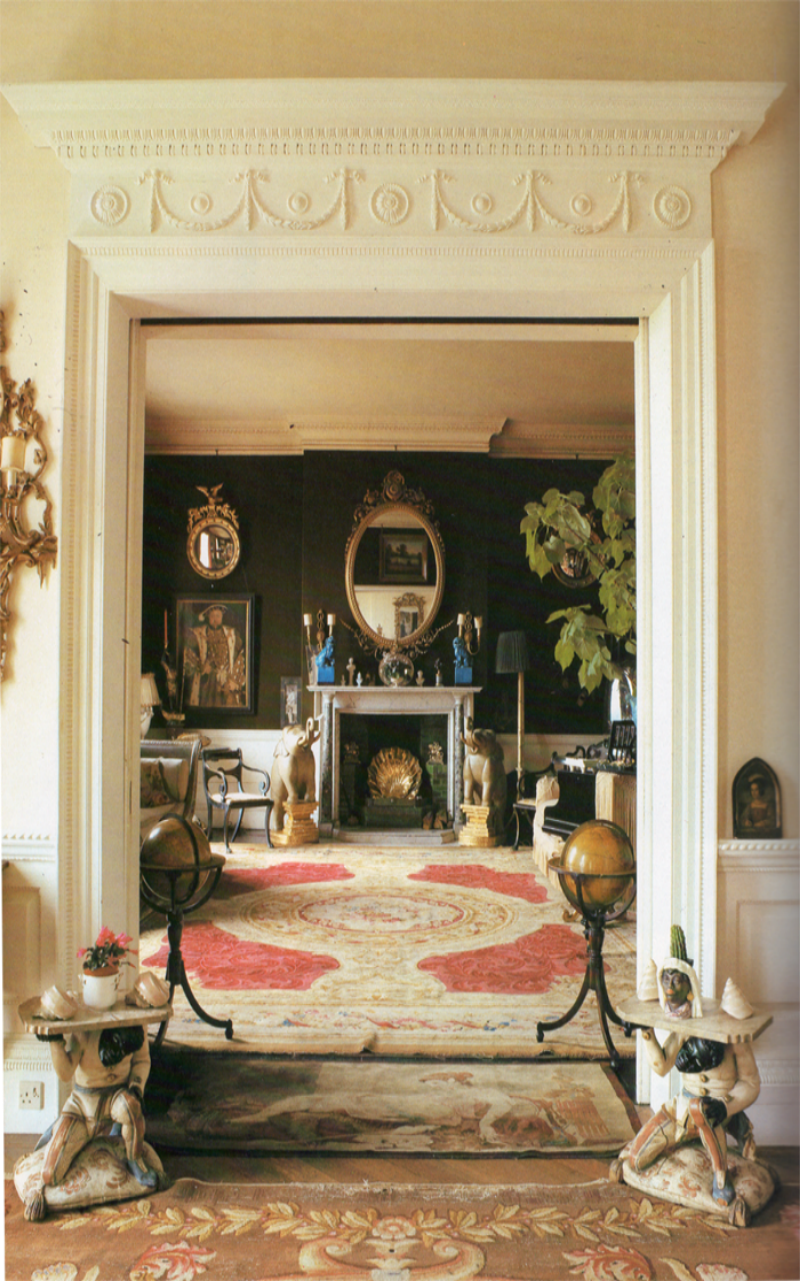
Here's a sneak peek of an upcoming project I've been working on. There's still lots to do but it's starting to come together.

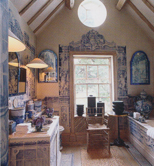
Here's a sneak peek of an upcoming project I've been working on. There's still lots to do but it's starting to come together.

There’s no shortage of writing about Anouska Hempel. As a London woman about town turned self-made hotelier, Anouska’s fascinating life has been profiled numerous times.
However until this year, her interiors were mostly documented in periodicals and around the web. Now there’s a book of her marvelous work over the past four decades.
Her work is a bit of a paradox: highly varied yet unified. Her approach at Blakes London and Cole Park was over-the-top maximalist but she pared it all back to the most essential in her work at The Hempel and later La Suite West.
Throughout her work, one can see her hand in trademark elements. Strongly opinionated on color, Anouska limits her palette to just a few colors, of which black is often used in large doses. Stripes make frequent appearances, sometimes wrapped around poles that recall Venice’s mooring poles. Her intricate screens bolster the East-meets-West feel while thin candlestick lamps of her own design create dramatic pools of light.
Let’s take a look.


All images from Anouska Hempel by Thames & Hudson

One thing I hear often is the word simple. "I'd like to something simple" says the client or "Let's do something simple" says the designer. Yes, fewer things can help bring more emphasis to an exceptional work of art. A plain cotton fabric can emphasize a form and be infinitely more suitable than a lavish silk.
However, in interiors, as is the case with most design, the ones that are simple and successful are a result of a complex process of consideration and editing. The problem is that all too often, simple is a euphemism for unconsidered.
A justification for not putting forth the effort required to make something unique
A limited viewpoint that doesn’t incorporate considerations of time or place
The question then becomes: is simple a shortcut? Or are you doing something bold, different, opinionated, and considered that happens to be simple?


Images: Cy Twombly, John Fowler, John Saladino
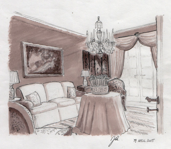
I find that sketches tell an entirely different story from floor plans, so I like to do one for every room I design. I’ve been working on a sitting room scheme for a while and today I got around to sketching out one of the views of the room.
This sketch is from the vantage point when one enters the room. I plan layouts such that each primary vantage point offers something unique and beautiful, presenting the room in a way that builds on the overall concept and creates an unfolding through experience.

John Fowler for Pauline de Rothschild, Architectural Digest May/June 1977
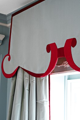
The trend lately has been to have very cautious curtains. Truthfully there are many times when a room calls for plain curtains. Take for example, a rustic cottage or a chalet in the mountains. A profusion of delicate passementerie there would feel unsuitable to the architecture and at odds with the honest charm of such spaces.
Then there are all of the over-the-top treatments from the 1980s that ignored architecture and scale. To make matters worse, the styles of this decadent decade were often rendered in inappropriate materials and by less than masterful hands. The resulting imprint has been a vulgar one, which is a shame as it’s cast collective doubt over a centuries-old craft.
But it’s not all doom and gloom. John Fowler (above photo) may have been the master of curtains, but there are many others carrying on his tradition or reviving the craft in new and unexpected ways. Let’s take a look:

Alex Papchristidis

Nicky Haslam

Howard Slatkin

Miles Redd

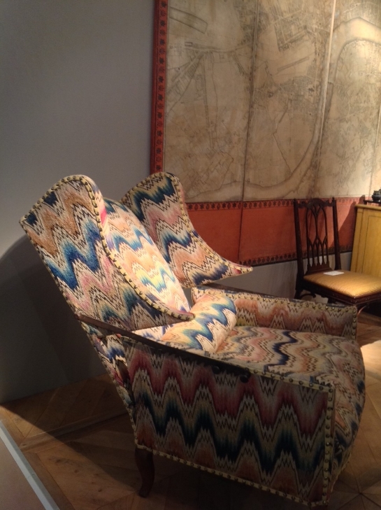
While the installation for this project is still several months away, I'm sharing a sneak peek of some pieces I've been bringing together for an upcoming project.
The first is an Edwardian-era Howard and Sons type armchair that's been refreshed and reupholstered in Dutch Stripe, from Jasper's Michael S. Smith collection. I couldn't be happier the way it turned out. It's headed to storage for the time being but I look forward to its arrival soon.

Fairs are one of the great pleasures of summertime and Masterpiece is one that shouldn’t be missed. One can’t help but be dazzled by the array of exquisite objects, ranging from artworks to jewelry to antiques. I hope some of you will take the opportunity to browse its range of exceptional pieces. Even if many of the pieces’ price tags have a digit too many to be within reach, the inspiration in abundance here costs no more than the entry admission. I always find that these sorts of venues are a terrific way to train one’s eye. Being particularly fascinated by pieces of the past, I love getting up close to furniture and studying colors, finishes, and patinas.
As a young designer I am constantly working on learning to see. Learning to see means not just spotting what’s trendy or what goes well with what. Rather, it’s about looking at visual properties, drawing connections and reading meaning. It’s about feeling the reason behind a sober neoclassical bookcase or being swept up in the exuberance of a gilded rococo console.
In our highly digital world where we live immersed in screens and remote connections, it’s critical to get out into the world, train your eye, grow your visual vocabulary, and truly see. So if you’re in London, get to Masterpiece and get inspired.
An 18th C. walnut sleeping chair having its original needlework, French c. 1760.

A George II painted carved pine open bookcase, c. 1735. Edward Hurst.

A Pair of George II Giltwood Armchairs in the Manner of Thomas Chippendale, c. 1755. Frank Partridge.
An Early 19th C. Lacquer Cabinet on Stand, China. Mallett.

An 18th C. Pine and Polychrome Lacquer Magot, Germany. Chiale Antiquariato.


One of a Pair of George II Giltwood Mirrors Atrributed to Benjamin Goodison, c. 1735. One of a pair of George III Chinese Lacquer Commodes Almost Certainly by John Cobb, c. 1765. Ronald Phillips.
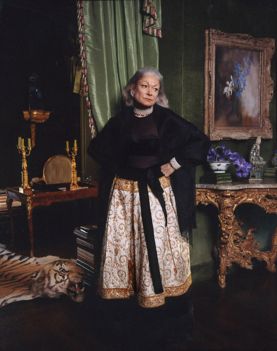
Before today’s technology boom there was a small coterie of San Franciscans living in some of the most beautiful residences in the world.
Today, Denise Hale carries on that tradition in her Russian Hill apartment, whose interiors are little changed since having been designed by Mark Hampton in the early 1980s.
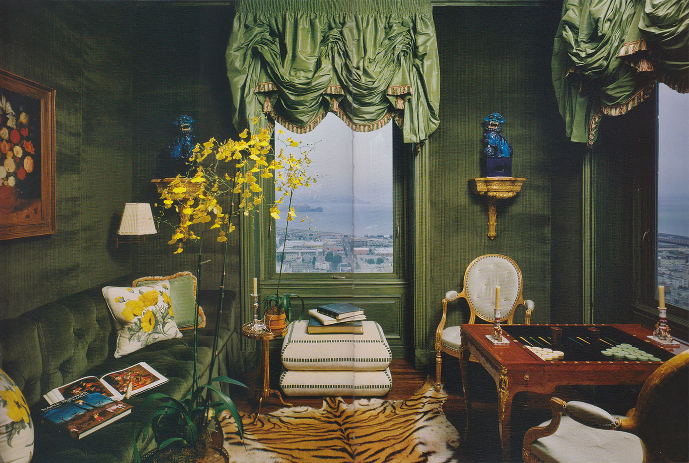
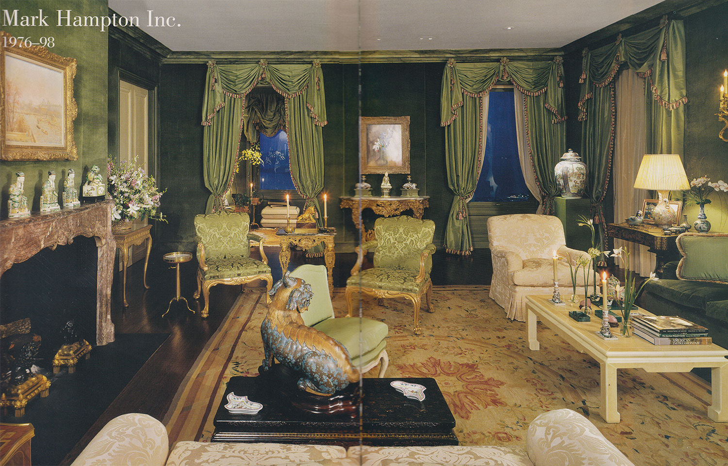
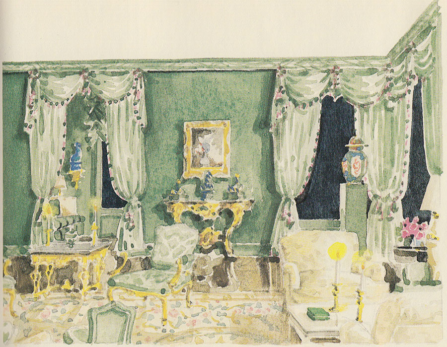
Hampton created this watercolor for his insightful and beautiful book, Mark Hampton on Decorating, depicting the scheme he used at the Hale residence. Describing how he came to use green as almost a neutral, Hampton said:
“The real way to understand color is to spend a lot of time looking, and when you think of it, green is one of the most pervasive colors in nature and in art. Whether or not it is predominant in decorating, it has an ability to settle in with practically any other color.”
Hampton combined many shades through the linen velvet walls, silk taffeta curtains, damask upholstery, and marbleized woodwork. One wonders if anyone is still decorating this way in San Francisco.
Top photo by Larry Sultan. All others photos from Mark Hampton, An American Decorator. Illustration from Mark Hampton on Decorating

Every project starts somewhere...An inexcusable dangling bare bulb where a chandelier will soon hang
If the work I've been posting recently feels overly lofty, you'll be happy to hear about my new feature, simply titled Projects. I'll be chronicling my own design projects, from their very earliest inklings to full realization. You'll get a glimpse of what goes into conceptualizing a truly beautiful space, the refinement of a design, sourcing of furniture and supplies, and the process of installation. If you can't be bothered with the nuts and bolts, worry not as I'll still be posting beautiful spaces.
So we'll start with something nearly hopeless: my own rental apartment. I just moved into this place and as clichéd as it may sound, it really is a blank canvas. Its strengths are excellent light, a terasse with views of some lovely 19th C. buildings, good room volumes, tall ceilings, and a few bits and pieces of the original late 19th C. finishes. On the downside, the parquet floors vary in design and color from room to room, most of the original mouldings have been removed, and all of the rooms have just a single, dreadful modern window.
Significant construction, such as replacing the windows or staining the floors, is out-of-scope as this is a rental. So I am working with the apartment's fundamentals and am looking forward to a glorious and challenging project.
If you want to take a look at or possibly even own a a small piece of a seminal designer's work, this is your week to do so.
More than any other project, this drawing room at Hambleden Manor shows the influence of Italy on John Fowler's work. In the 1950s Fowler went to Italy and toured several of Palladio's villas. After returning to England, John was able to pair his inspiration with a new client's heritage. John gained his first Italian client, Maria Carmela, Viscountess Hambleden in 1956. Together with Lady Hambleden, John created an Italian atmosphere in this Buckinghamshire manor.
Although not totally apparent from this photo, the room was initially painted quite a bright pink. Lady Hambleden found the color too strong and asked John to revise the scheme. Yet John refused, saying "If you start with such a pale shade it will fade to a terrible yellow." Lady Hambleden acquiesced and the room eventually faded to a lovely apricot as seen here.
Sadly, the room has now been dismantled and the contents will be sold. Colefax and Fowler, Then and Now is happening this coming Wednesday at Christie's in South Kensington and nearly all of the contents of this room are coming up on the auction block, including:
A set of three Italian giltwood armchairs, third quarter 18th C. Est. £5,000 – £8,000.
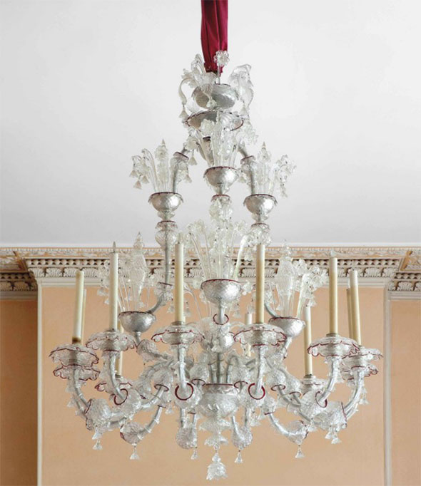
A Murano glass chandelier designed by John Fowler in 1955. Est. £10,000 – £20,000. Notice the faded apricot walls?
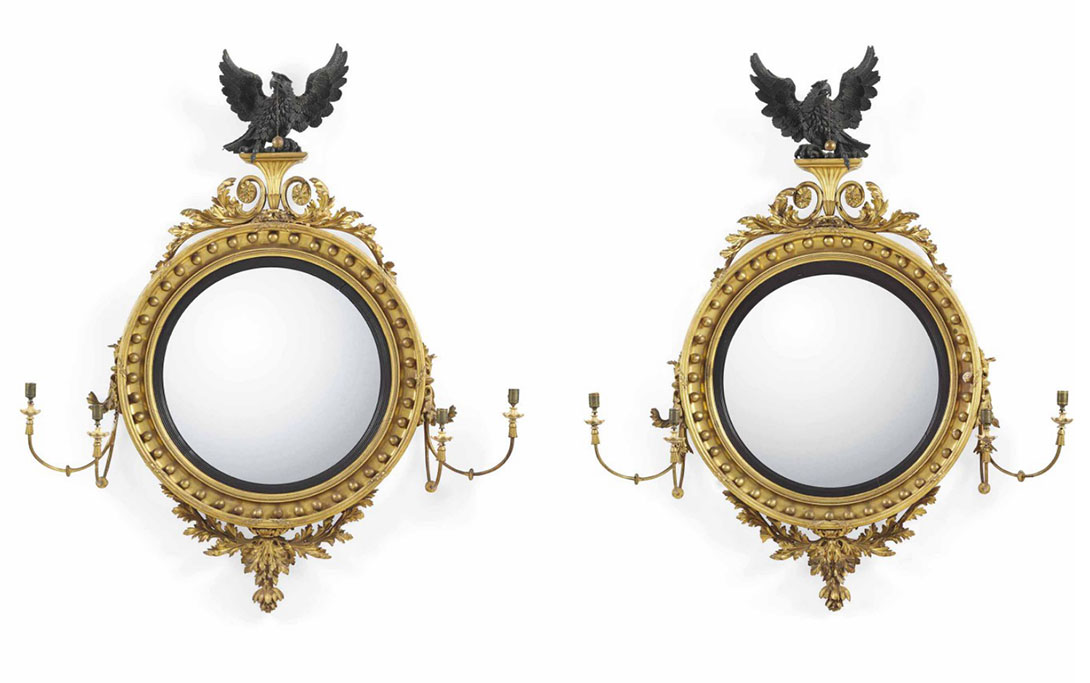
A pair of Regency giltwood, ebonised and bronzed large convex girandoles, circa 1810. Est. £20,000 – £40,000.
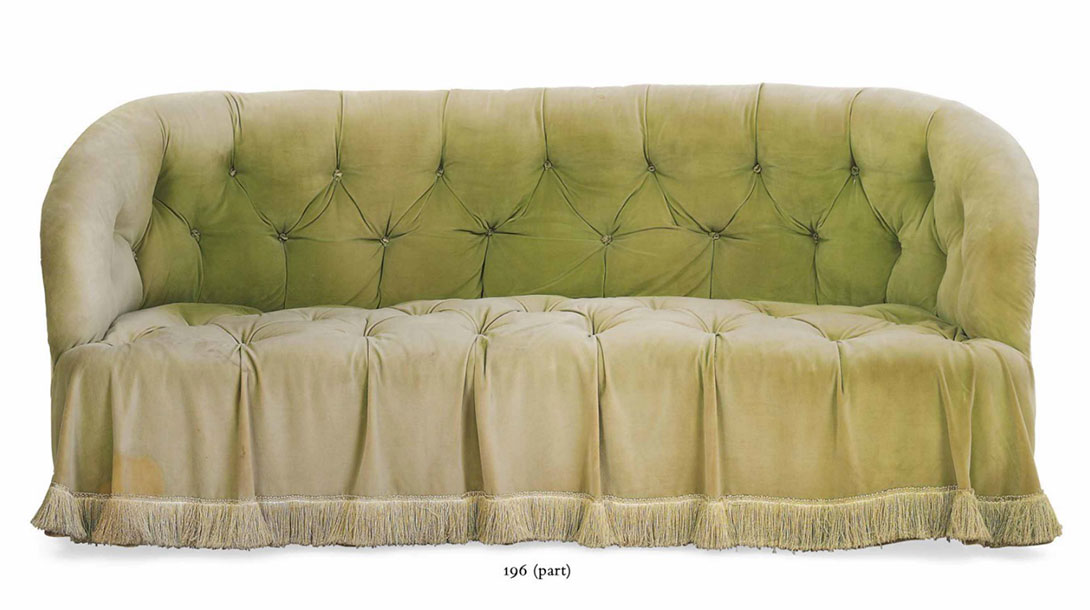
A near pair of green velvet banquettes. Est. £300 – £500. Sure, the upholstery is tired, but they're still wonderful. Images above from Christie's.
Top image from John Fowler: Prince of Decorators by Martin Wood.

A Louis XV fauteuil stamped C. Sene. Est. 8,000 - 12,000 EUR. Image from Sotheby's.
It is no secret to my close friends that I am absolutely obsessed with auctions. For me it's not simply about the thrill of the hunt, but rather seeing an individual's oeuvre first hand. With the Spring upon us, it's that time of year when almost every auction house seems to have an upcoming sale. Having just moved to Europe, I am dangerously close to the auctions of Paris and London, where some of the most exciting pieces are coming up for sale. In the coming weeks, these fascinating pieces could be yours or mine.
Enjoy!

A Louis XIV giltwood console table in the manner of Nicolas Pineau. Est. £3,000 – £5,000. Image from Christie's.
A Dutch carved giltwood mirror c. 1720, in the manner of Daniel Marot. Est. £4,000 – £6,000. Image from Christie's.

Beautifully detailed.

A late 17th - early 18th C. Swedish mirror attributed to Gustav Precht. Est. 10,000-12,000 EUR. Image from Sotheby's.
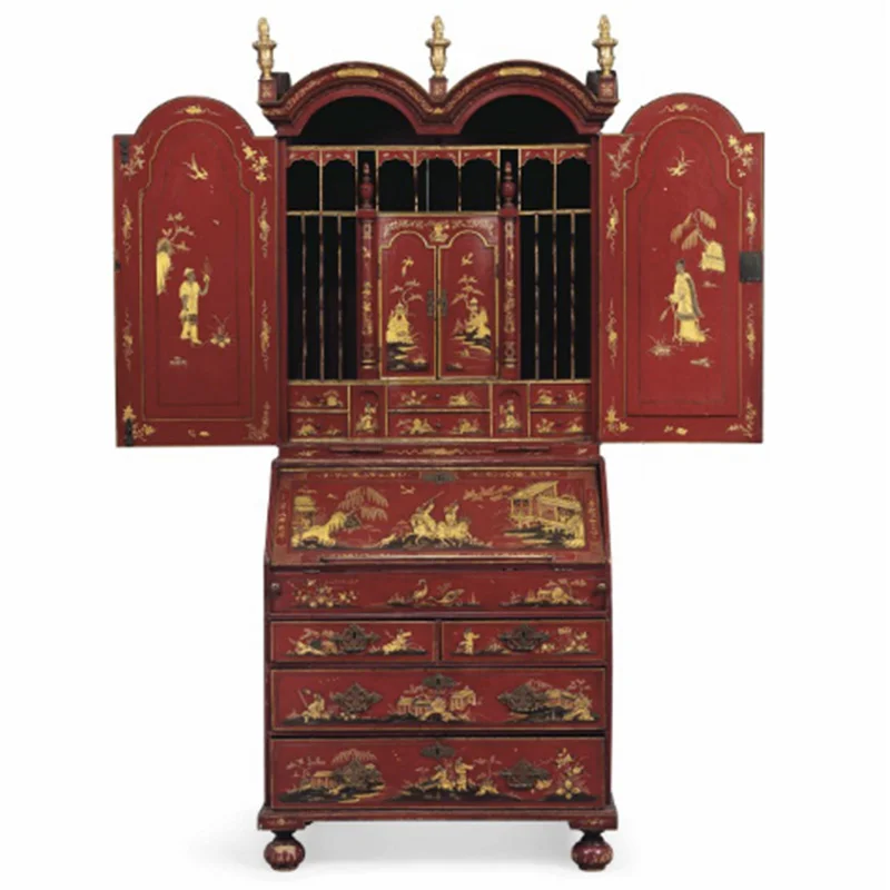
An Anglo-Dutch Bureau cabinet, partially 18th C. Est. £7,000 – £10,000. Image courtesy of Christie's.
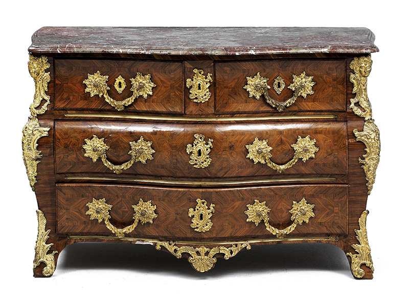
Louis XV bombé chest of drawers, mid 18th C. with rosewood marquetry and gilt mounts. Est. 10,000-15,000 EUR. Image from Dorotheum.


Built in the mid-17th Century, Hôtel Lambert is a spectacular mansion on the tip of the Île Saint-Louis. The mansion has an incredible history and been home to a string of notable residents, including Voltaire. More recently, the home has been home to the late Baron and Baroness Guy de Rothschild, who acquired the property in 1975 and worked with Renzo Mongiardino to refresh the interior spaces. The images above date to their days here.
The property's current owner, Sheikh Abdullah bin Khalifa Al Thani of Qatar, now wants to overhaul the structure including the addition of lifts, air conditioning, and an underground car park. Conservationists, neighbors, and former residents are all over this one, but what a shame. It's hard to imagine anything more perfect than the hôtel in the images below.
Images from Private Paris by Marie-France Boyer.

The fashion set knows her well, but her home is perhaps just as remarkable and unique as her attire. Brilliant and fearless, Iris Apfel has created a space full of her life's collections. This New York apartment clearly subscribes to an eclectic and layered approach, not one of rigid rules or prescribed formulas. She and her husband founded Old World Weavers, which explains at least in part the profusion of textiles. Beyond the multitude of patterns and prints, the lighthearted and theatrical nature of this space gives it a life and exuberance so rare in today's interiors. Bravo.


Top image from The New York Times. All other images from Architectural Digest.

This drawing room at Easton Gray House in Wiltshire is one of my favorite rooms by Tom Parr. There's a lot of subtlety and detail from the layered blues used on the walls to the stenciled floor. The black and white engravings of Rome look particularly striking against the wall color. Their frames are tied to the three black Japanned tables and fire screen without being too obviously coordinated. The vases above the pedimented door are a nice touch, adding dimensionality and interest.


Parr, who passed away last year, initially worked with David Hicks and later became a partner in Colefax and Fowler in 1960. He is largely credited with turning around the company's finances and he remained involved until his retirement in 1996. I hadn't seen a lot of his work previously as he has been somewhat overshadowed by his legendary predecessors. However, Parr struck his own tone and in his time contributed some truly impeccable rooms to the Colefax and Fowler portfolio.
Images from The House & Garden Book of Classic Rooms.

Today I'm continuing the small space theme and showing the work of Christopher Leach. Leach has a beautiful project in this month's British House and Garden but his own London flat is my favorite. There's so much to love in such a small space.


Images from World of Interiors, August 2010.
Perhaps because I live in a rather small rental, I was particularly intrigued by this West London drawing room, whose designer is unknown. The space is compact yet the scale of the pieces is anything but. A large portrait, substantial Asian porcelain pieces, and massive gilt candle sconces, all vie for attention. However, the result somehow feels balanced and proportioned. The blues throughout the room make the space feel thoughtful and designed rather than haphazard. For all of those who struggle with how to make a rental great, this space inspires: notice the plain wall color and simple window treatments, the former often off-limits to renters and the latter hard to invest in for a temporary stay. Great pieces and a sense of balance complete this room without the need for additional elements.
Image from Interiors by Min Hogg.
A legend in the world of design, Jacques Garcia is perhaps best known for his contemporary interiors. So today I bring another masterpiece of his, but a much more historically-oriented one: his Paris residence as it was in the late 1980s following an extensive rehabilitation of the historic structure.
Located at 28 Rue des Tournelles, Hôtel de Sagonne was designed by Jules Hardouin Mansart (1645-1708), chief architect to Louis XIV, when he was just 28 years old. The mansion's construction commenced in 1674 but didn't complete until 1685 as Mansart was simultaneously working on other masterpieces including the Hall of Mirrors at Versailles. When Jacques Garcia took hold of the property he performed extensive restorations to uncover the original ceilings and reinstate the boiseries and floorboards in a way that did justice to the original.
There are so many things I love about this space, beyond just the exquisite French antiques, many of which were royal pieces dispersed during the French revolution.
This former office of Mansart is intimate but also incredibly elegant with its original boiseries. The lit d'alcove looks like such a nice spot to do some reading, sheltered by the curtains and a warm space full of books.

The kitchen also serves as a dining room and features the original Delft tiles. This space is such a refreshing counterpoint to the enormous industrial kitchens so in vogue today, where everything looks as if it belongs in a car manufacturing plant. No enormous island. No stainless steel appliances. I'm really not sure where the refrigerator and range live and I rather like it that way.

Images from Private Paris by Marie-France Boyer.

Chateau de Montgeoffroy is located in the Loire Valley and dates to the 1770s when it was built for Marquis de Contades. The oval dining room was the first of its sort to be built in France and signaled a shift away from the mainstream preference of the French to dine in their salons. Notice the width of the Louis XV chair seats - these were designed to accommodate ladies' skirts, which were quite large at the time. It is speculated that this table may have been the first at which pâté de foie gras was served as the delicacy was invented by the Marquis' chef. I'm not particularly enamored with pâté de foie gras but this room is another story altogether.

Top image from Interiors by Min Hogg. Exterior images by Manfred Heyde.

Today I bring you Faringdon House in Oxfordshire, a late-Georgian manor once owned by the eccentric Lord Berners. A modernist composer, Dadaist painter and writer, Lord Berners entertained an incredible crowd at Faringdon including Cecil Beaton, Dali, Fonteyn, H G Wells, Stravinsky, and Gertrude Stein.
I was drawn into the double drawing-room (below) with its contrasting dark and pale schemes. The contrast is unexpected and reflects the nature of the house where walls hung with Corots, Constables, and Matisses contrast with tongue-in-cheek phrases adorned the walls, such as one at the top of the stairs that reads "No dogs admitted."
As of 2001, the home was still in the hands of a relative of Berners, who at the time was renting the home for £8,000 per month. Read more about her here.
Images from English Elegance by Judy Brittain
As I embark here I hope to bring a meaningful point of view on design, culture, and life. It's hard to say exactly where I will go on these pages but living in a world rich in beautiful spaces, atmospheres, and experiences, I hope to bring a small fraction here and start a dialogue.
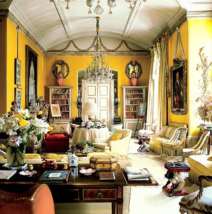
So today I begin with a very famous room that looks as good today as when it was designed in the late 1950s: the Yellow Room at Avery Row in London. A collaboration between John Fowler and Nancy Lancaster, it showcased both of their talents perfectly. In reading Colefax and Fowler: the Best in English Decoration, I realized how much Nancy Lancaster advanced John Fowler's aesthetic and this room is a perfect example. While Fowler was responsible for the paint treatments including the swagged husks above the cornice and the incredible curtains, the basic concept including the composition and color scheme was that of Nancy Lancaster.
Beyond the confident and marvelously executed paint, curtains, and floor plan, the room had a wonderful balance between formality and comfort - a trademark of the firm's work. What I love is the warmth and depth of the space, which blended many shades of yellow to create a nuanced effect that keeps one's eye moving and interested. I've studied this room time and time again but I always notice something I hadn't before, making this room one of my favorites.
Enjoy.
Image from Colefax and Fowler: the Best in English Decoration by Chester Jones